

Forest
#123F32Primary brand and dark backgrounds
 Back to pickup
Visual identity · Version 1.0
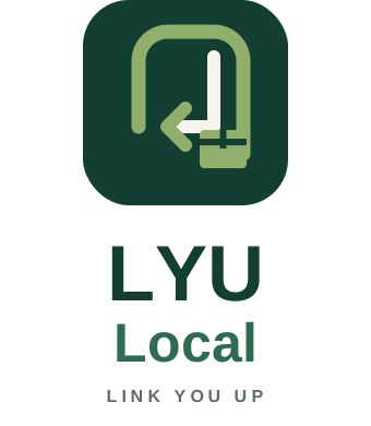
LYU means “Link You Up.” The doorway, return arrow, and parcel make our purpose clear: a reliable local connection from the customer’s doorstep to the right destination.
Logo suite
Color system
#123F32Primary brand and dark backgrounds
#8FAF6BQuiet route accents and small highlights
#F4F2E9Warm, neighborhood-friendly background
#2F6B50Secondary text and supporting shapes
#E8EEE7Panels, forms, and soft highlights
#102A22Headlines and body copy
Type & voice
Use Arial or Helvetica in bold, compact headlines and calm sentence-case body copy. Lead with the customer benefit, then explain the rule.
Photography
Use real residential doorsteps, sealed packages, pickup actions, return arrows, or “prepaid return” cues. Avoid carrier logos and images that look like ordinary package delivery.
Usage rule
Use forest green as the foundation and lime as an accent, not the entire page. Never stretch the logo, recolor individual parts, add glow effects, or place it on a busy image.